Nappier is a modern landing page concept designed for a premium sleep and wellness brand. The product focuses on improving sleep quality through thoughtfully designed routines, calming products, and a holistic approach to rest. The goal of this project was to create a visually refined and conversion-focused website that communicates trust, comfort, and simplicity — while presenting the brand as both premium and approachable.
Sleep and wellness brands operate in a highly competitive space where differentiation is often subtle. Most websites rely on similar messaging, soft visuals, and generic layouts, making it difficult to stand out or build a strong emotional connection. The challenge was to design a landing page that feels calming and minimal — without becoming generic — while still clearly communicating value and guiding users toward action.
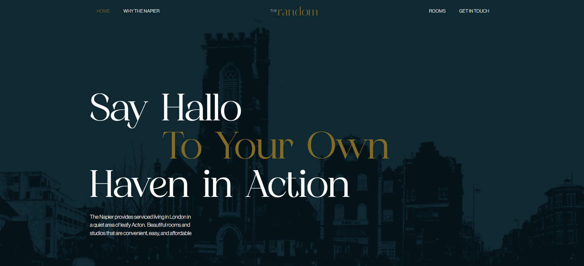
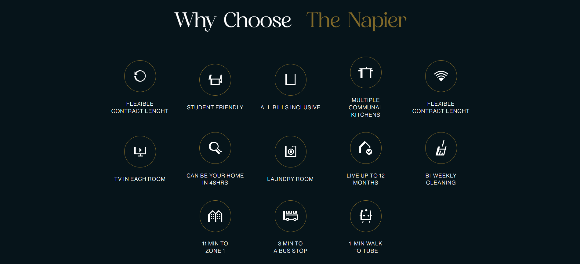
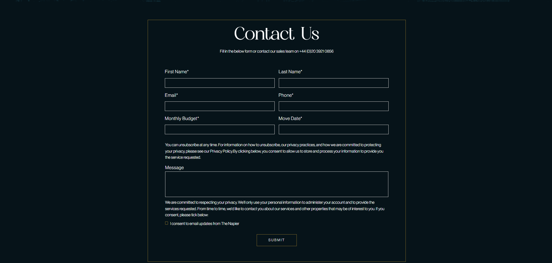
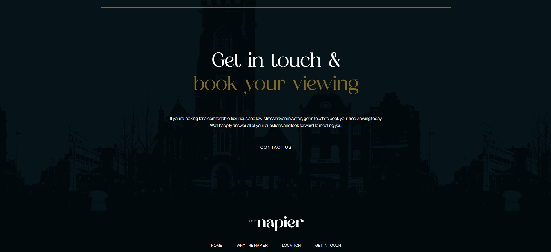
Nappier was designed with a strong emphasis on visual clarity, spacing, and emotional tone. The layout uses soft typography, neutral color palettes, and clean sections to create a sense of calm and focus. Content is structured to guide the user naturally — from understanding the problem (poor sleep), to exploring the solution (products and routines), and finally toward conversion. The design balances aesthetics and usability, ensuring the experience feels smooth, intentional, and easy to navigate.
The project was built in Webflow with a focus on clean structure and maintainability. Classes were organized using a consistent naming system, allowing for scalability and easy updates. Special attention was given to spacing, typography hierarchy, and responsive behavior across devices. Interactions and animations were kept subtle to enhance the experience without distracting from the content. The goal was to create a production-ready layout that can be easily extended into a full product website.
One of the main challenges was achieving a balance between minimalism and clarity. Reducing visual noise while still communicating enough information required careful structuring of content and hierarchy. Another challenge was creating a premium feel without relying on overly complex design elements — instead focusing on spacing, typography, and composition.
Nappier resulted in a polished, high-end landing page that effectively communicates a wellness-focused brand. The project demonstrates strong attention to visual design, layout systems, and user experience. It highlights my ability to design modern, conversion-oriented websites that balance aesthetics with functionality — particularly in lifestyle and wellness industries.
